In the ENGAGE project, we strongly believe in the value of defining and distinguishing informal solutions from formal ones. As we discussed in a previous blog post, this differentiation is crucial for understanding the benefits and limitations of each approach. Building on this idea, we have developed a comprehensive template for characterising informal solutions. Our template includes a range of essential attributes that will help us to better analyse and understand these solutions. The attributes of the template and an example are described below.
- Name: the title of the solution,
- Who developed the solution,
- Who is using the solution,
- Description: the description of the solution and how it works, giving an idea about the context,
- Why/When: The factors, or “drivers” which lead to the creation of the solution,
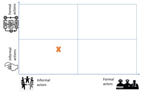
- The placement of the solution considering the figure below. This is driven by the idea that the solutions always fall on a spectrum from completely informal to completely formal.
- The extent of formalisation: This includes information on whether or not the solution has been formalised or widely adopted and a description of which factors could impact the formalisation process.
Example: John Hopkins Covid-19 Dashboard
Developer: Researchers at the Johns Hopkins University, USA.
This is an informal actor, it is not an emergency organisation, nor an NGO, it is a university. Still, it is a formal entity but not related to emergencies and does not hold any legal accountability in disasters, also, it does not involve spontaneous volunteers that appear at the emergency scene.
User: Governments, the general public, journalists, researchers.
Description: During the Covid-19 outbreak, a researcher at the University of Johns Hopkins, USA developed an online dashboard2 to track statistics about the coronavirus worldwide. These statistics cover the number of cases, deaths, vaccine doses, etc. The dashboard uses hundreds of data sources and news outlets from around the world such as 1point3acres. The researchers even received emails from people all over the world reporting new cases that were not accounted for in the dashboard. The dashboard was started as an initiative by a post graduate student, Ensheng Dong, at the Center for Systems Science and Engineering, Johns Hopkins University. The student discussed the idea with his supervisor Dr. Lauren Gardner and the project started. Soon, the group of Dr. Gardner was working on data collection and curing. Then, due to the high demand and the high amounts of data, the Applied Physics Lab at the university started supporting the group with the necessary back-end technology. After that, Esri the GIS company, started helping with managing the platform [1]–[3].
Why/When: Once Ensheng Dong heard the news about the virus spreading in China, his home country, he was concerned about the safety of his family and friends; especially since he studied epidemics and knew how dangerous viruses could be. Then, the first case of Covid-19 in the USA was confirmed on January 20. The next day, Dong was discussing the idea with his advisor Dr. Gardner and they agreed to develop a dashboard to track the virus building on a GIS.
The dashboard appeared at first as a personal initiative, that was driven by personal interest and the absence of an alternative. The COVID situation was unexpected, the governments were not prepared to face it, and when it happened, they were busy trying to stop the spread of the disease, solve the bed availability issues, and search for a treatment and a vaccine. They did not allocate the resources to accurately track all the statistics about the COVID situation. Moreover, the different cities and states did not have a clear procedure for data reporting. Hence, the solution appeared to cover a gap in government efforts.
The figure below shows where the solution falls on the informality quadrants (the lower left quadrant). The dashboard was developed by informal actors which places it into the left part of the graph, and it does not follow a pre-established plan, so it is placed into the informal actions.
The extent of formalisation: The dashboard was widely used across the globe, it has been accessed around 2.5 billion times since its beginning till now [4]. It started growing to the extent that the platform was supported by a private company like Esri. The data produced by the dashboard was consumed by media outlets, decision-makers, researchers, and reports worldwide. Despite its wide use, the solution was not formalised in the sense that the owner of the solution did not change, it was owned by the government or any other official organisation. Meanwhile, the World Health Organization (WHO) already built another dashboard to track COVID statistics.
The solution is repeated, tested, and validated, widespread, replicable, and it has a lot of collaboration behind it; all of these make it a very good candidate for formalisation.
By utilising this template, we hope to gain a deeper insight into the unique features and characteristics of informal solutions, and to better understand their potential value.
Authors: Sahar Elkady and Leire Labaka (TECNUN)